01 / The essentials
Width shows size
Height shows share
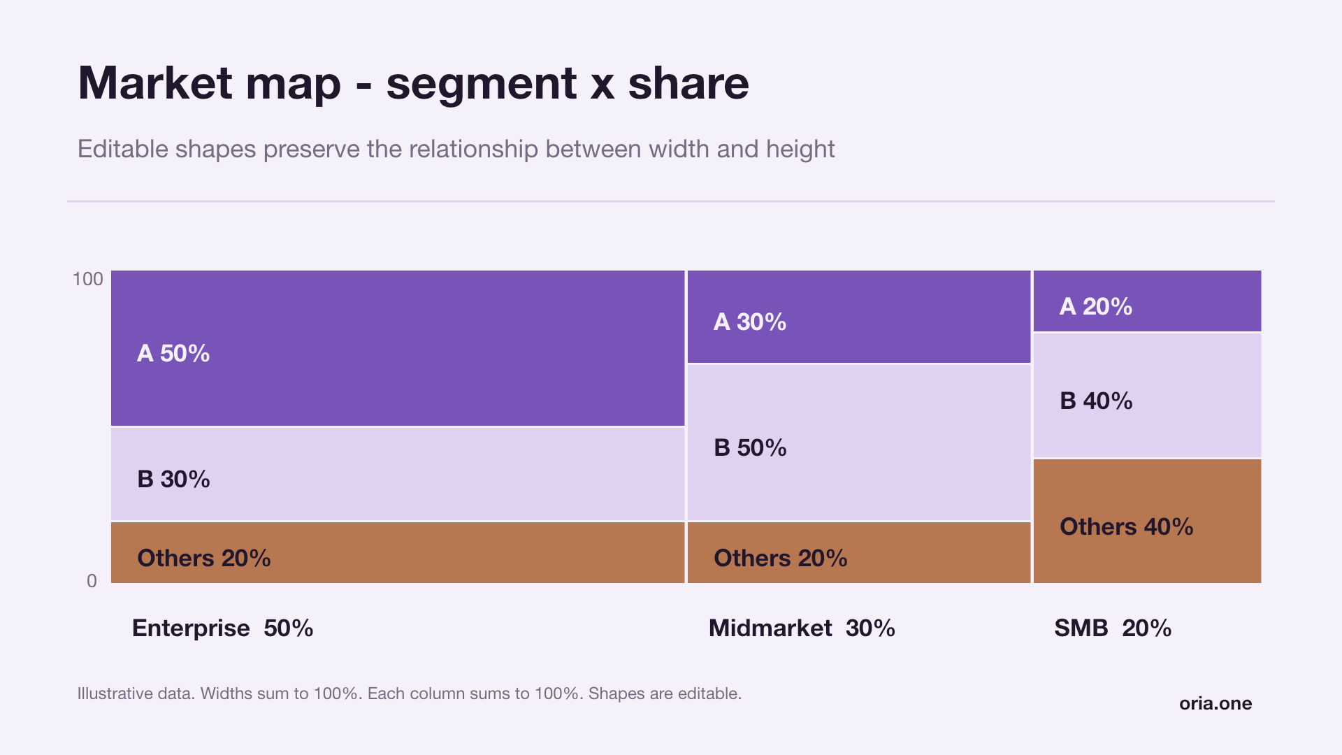
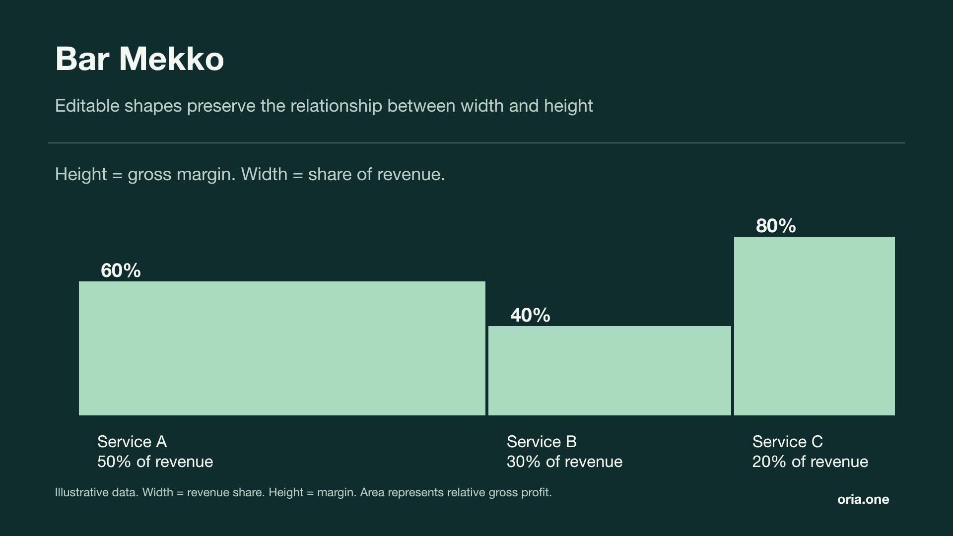
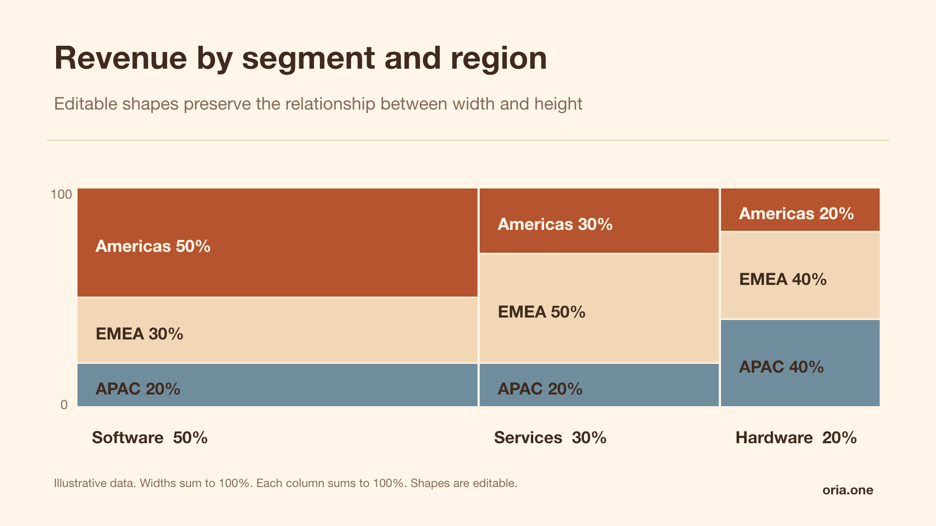
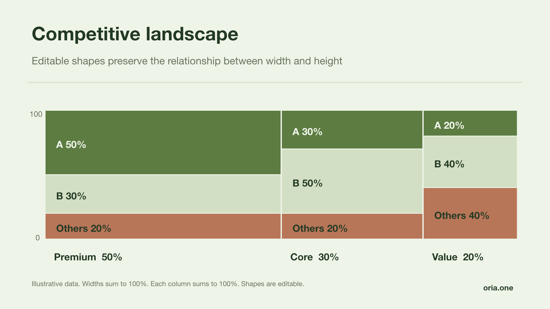
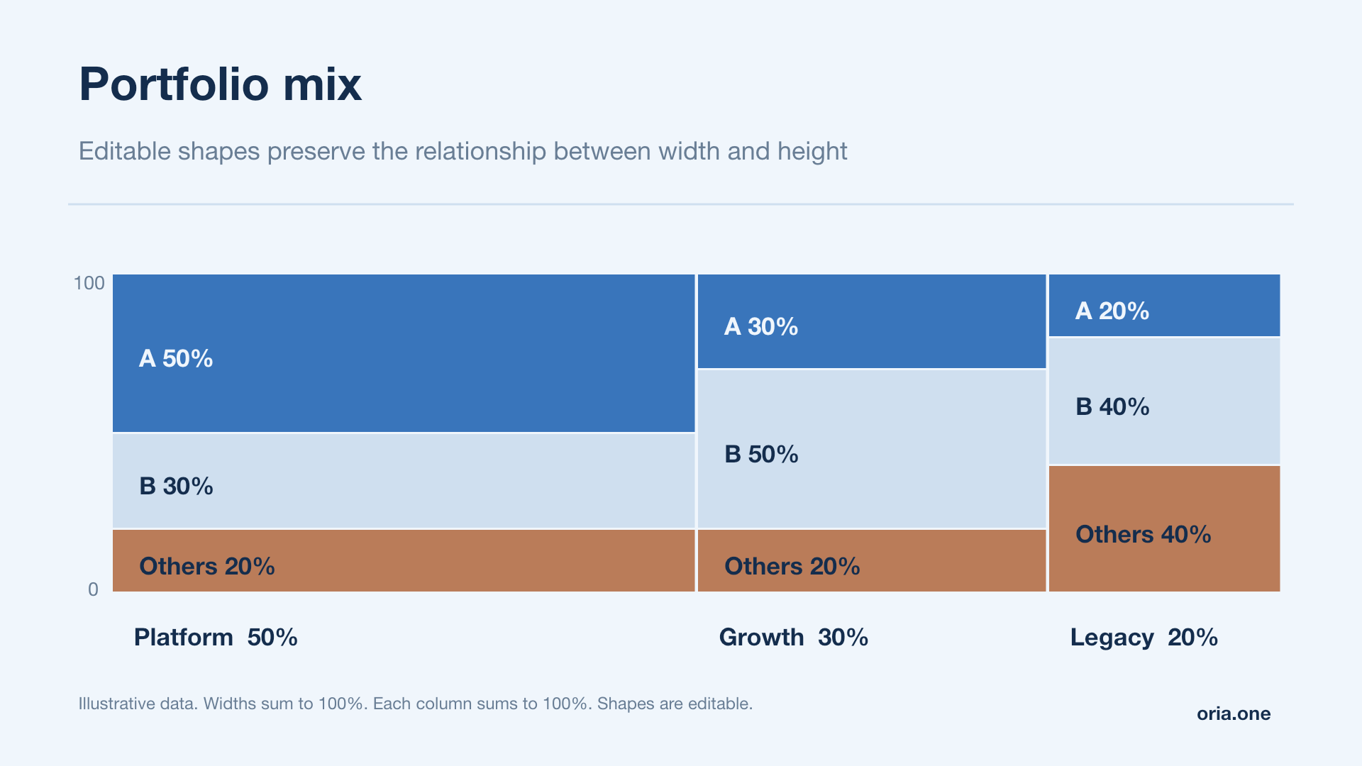
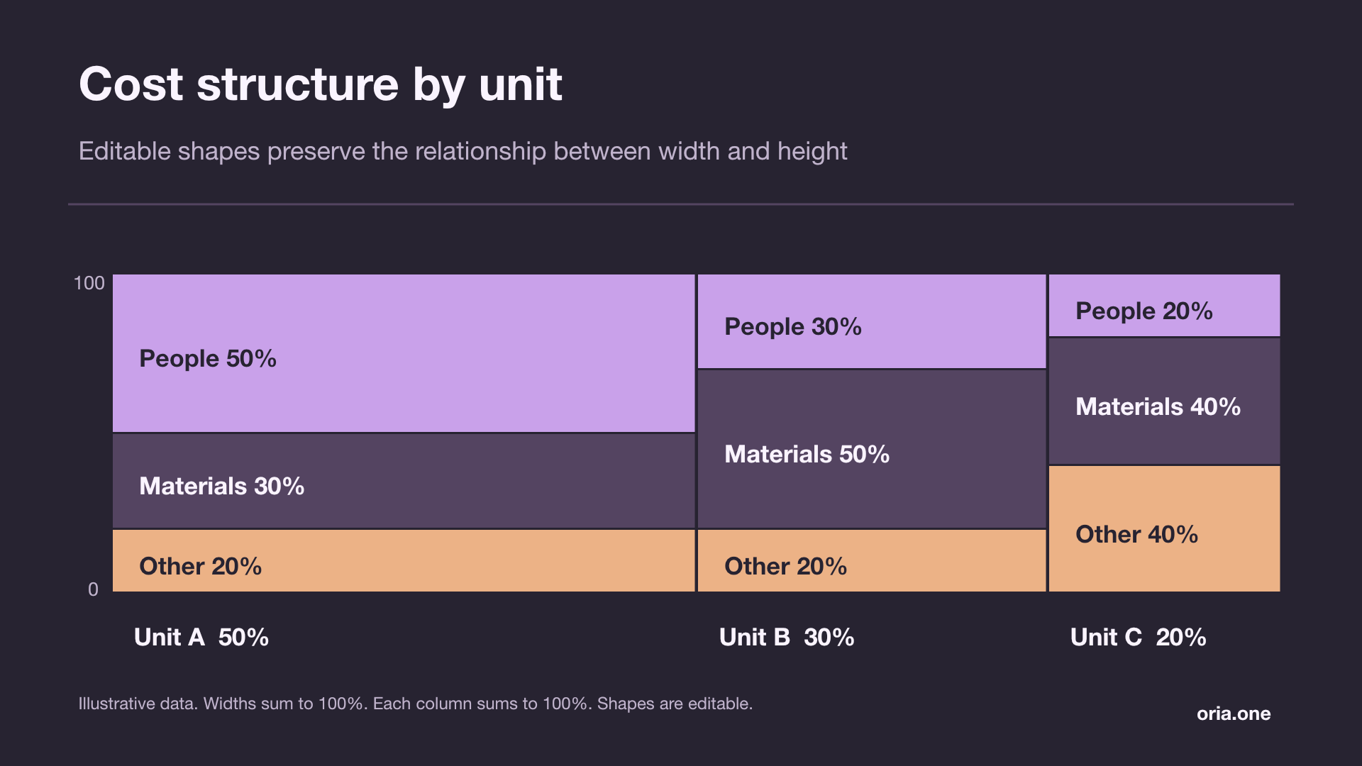
A Mekko, or Marimekko, is a stacked chart with variable column widths — each column represents a segment; its width shows the segment’s share of the total, and its coloured bands show the split within it
Because width and height both carry meaning, each rectangle’s area represents its share of the whole — use this when market size and competitive position matter together
Width
How large is the segment?
Height
What share does each competitor hold?
Area
How much of the whole market is that worth?
02 / The example
The leader is strongest
in the largest segment
In this illustrative $1bn market, Enterprise accounts for half of all spending — the leader’s 60% share there is worth $300m: 30% of the total market
| Segment | Market size | Leader | Challenger | Others |
|---|---|---|---|---|
| Enterprise | $500m · 50% | 60% | 30% | 10% |
| Mid-market | $300m · 30% | 30% | 50% | 20% |
| SMB | $200m · 20% | 20% | 25% | 55% |
50% × 60% + 30% × 30% + 20% × 20% = 43%The challenger holds 35% of the market and all others hold 22% — segment shares sum to 100% in every column
03 / Build the chart
Four steps to a useful market map
- 1
Start with one consistent data set
Use segment totals and competitor values for the same market, period and currency — reconcile each column before drawing it
- 2
Calculate the widths
Divide each segment total by the whole market — in the example, use 50%, 30% and 20% of the available plot width
- 3
Calculate the internal shares
Divide each competitor’s value by its segment total — stack these percentages to 100%, keeping the same series order across columns
- 4
Label size and share separately
Place segment names and sizes outside the plot — use percentages inside the rectangles — give the focal competitor a strong colour and keep the other fills quieter